
Google Unintentionally Reveals Material 3 ‘Expressive’ Design
Google has recently provided a sneak peek into its upcoming design language, Material 3 Expressive, through a blog post that was later removed. Although the post was unintended, it revealed key insights into the new design guidelines that the tech giant plans to officially unveil at Google I/O 2025 later this month. Described as a “bold new direction for design,” Material 3 Expressive aims to enhance user experience by focusing on various design elements, including color, shape, and motion.
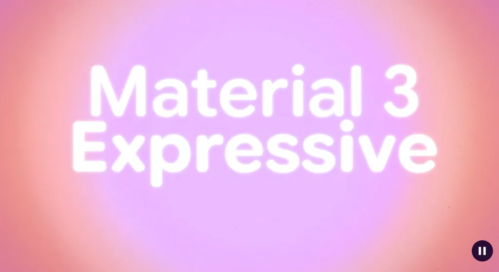
Overview of Material 3 Expressive
The blog post, which was archived by the Wayback Machine, outlines the fundamental aspects of Material 3 Expressive, also known as M3 Expressive. This new iteration emphasizes usability by making key actions more prominent and grouping similar elements together. One of the standout features is a floating toolbar, which is designed to improve user interaction by expanding on existing standards for tap target size and color contrast. This approach aims to create a modern, clean, and energetic appearance for applications.
Screenshots shared by 9to5Mac depict a pill-shaped toolbar that does not cover the entire screen, allowing a glimpse of the background. Google’s intention is to modernize its design language, making it visually appealing while enhancing functionality. The research behind this design involved collaboration between researchers and designers, who tested various screen designs to evoke desired emotional reactions, such as playfulness and friendliness.
User-Centric Research and Findings
Google’s research into Material 3 Expressive involved innovative methods, including the use of eye-tracking glasses to observe user interactions with the interface. Participants in the study were able to identify key UI elements up to four times faster than with the previous version of Material 3. This improvement was achieved by modifying simple UI elements, such as enlarging the “Send” button, using a secondary color for emphasis, and repositioning it above the keyboard.
The findings suggest that the new design significantly enhances navigation speed and usability. Google claims that the changes implemented in Material 3 Expressive help level the playing field for users of all ages. By incorporating larger buttons and improving visual contrast, the design aims to eliminate age-related disparities in user performance. Notably, users over 45 years old demonstrated performance on par with younger users, indicating the design’s inclusivity.
Impact on Brand Perception
The introduction of Material 3 Expressive has also been linked to an increase in brand perception among users. Products utilizing this new design have reportedly experienced a 32% boost in their “cool” factor and a 34% increase in modernity, contributing to a fresh and forward-thinking brand image. Google found that users across various age groups preferred the expressive design over the traditional non-expressive design that aligns with iOS Human Interface Guidelines.
Despite these positive outcomes, Google acknowledges a significant challenge ahead: familiarity. As the new design style is adopted by more applications over the coming year, the company aims to enhance user familiarity with Material 3 Expressive. This effort will be crucial in ensuring that users can seamlessly transition to the updated design language while enjoying its improved usability and aesthetic appeal.
Observer Voice is the one stop site for National, International news, Sports, Editor’s Choice, Art/culture contents, Quotes and much more. We also cover historical contents. Historical contents includes World History, Indian History, and what happened today. The website also covers Entertainment across the India and World.